The Role of Colour Theory in Packaging Design
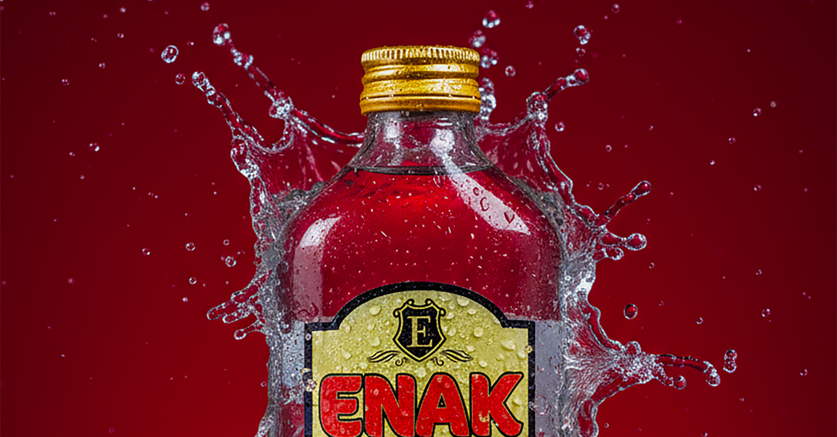
Table Of Contents
Trends in Packaging Colour Design
The landscape of packaging colour design is continuously evolving, influenced by cultural shifts and consumer preferences. Bold and vibrant colours often capture attention on retail shelves, while pastel hues can evoke feelings of calm and nostalgia. Brands are increasingly experimenting with gradient colour schemes and metallic finishes to stand out in a competitive market. This shift has led to innovative packaging solutions that not only highlight the product but also create an emotional connection with consumers.
Minimalistic designs with a focus on monochromatic palettes have also gained popularity. Such approaches often reflect a commitment to simplicity and sophistication, appealing to a more discerning audience. Earthy tones are emerging as a favourite for brands targeting environmentally conscious consumers, aligning the product’s aesthetic with sustainability values. These trends indicate the importance of not only attracting attention but also communicating brand identity effectively through colour.
Staying Current with Consumer Preferences
Understanding consumer preferences is vital for effective packaging design. Trends can shift rapidly, influenced by cultural movements, social media, and changing lifestyle choices. Designers must remain agile, consistently researching and analysing colour trends that resonate with target audiences. Engaging with consumers through feedback and surveys also provides insights into their emotional responses towards colours, enhancing design considerations.
The impact of colour on purchasing decisions cannot be underestimated. Bright, bold colours often evoke excitement, appealing to younger demographics. In contrast, muted tones may attract consumers seeking sophistication and sustainability. Adjusting colour palettes in response to shifting preferences enables brands to maintain relevance and drive consumer engagement, ultimately influencing shelf appeal and brand loyalty.
Colour Contrast and Visibility
In packaging design, the use of colour contrast plays a critical role in ensuring products stand out on shelves. High contrast can capture attention quickly, guiding potential customers to specific items amidst a sea of options. This strategy not only enhances visibility but also aids in brand recognition. By employing contrasting colours strategically, brands can create a more appealing visual experience that encourages consumer engagement.
Visibility must also be balanced with readability, particularly for text on packaging. Clear, legible typography achieves better communication of vital information. Designers should consider factors such as background colour, text size, and font style to ensure that key details are easily comprehensible. When consumers can effortlessly interact with product information, it increases the likelihood of making a purchase.
Ensuring Readability and Attraction
Effective package design requires a careful balance between aesthetics and functionality. The choice of colours can greatly influence how well a brand communicates its message. High contrast between text and background enhances readability, ensuring that vital information stands out. Consumers are more likely to engage with packaging that allows for quick comprehension, particularly in a crowded marketplace.
Attraction also plays a significant role in drawing consumers’ eyes. Strategic use of colours can evoke emotions and associations that resonate with target demographics. For instance, bright and bold colours may suggest excitement and energy, while softer tones can convey a sense of calm and reliability. Ultimately, the right colour strategy not only serves to please the eye but also to facilitate a swift understanding of the product.
Colour and Environmental Considerations
The increasing emphasis on sustainability influences the choices brands make in packaging colour design. Many companies are now seeking eco-friendly pigments and dyes that reduce environmental impact. This shift not only caters to consumer demand for greener products but also aligns with global efforts to promote responsible production practices. By opting for natural or organic colourants, brands can enhance their image while contributing to a healthier planet.
Packaging designers must consider the lifecycle of their colour choices. Selecting materials that are recyclable and biodegradable can significantly affect a product's overall environmental footprint. Brands can also utilise minimalist colour palettes to lessen waste during production processes. This approach not only appeals to environmentally-conscious consumers but also reinforces a brand's commitment to sustainability, making eco-friendly colour selection a pivotal aspect of contemporary packaging design.
Sustainable Choices in Colour Usage
The growing emphasis on sustainability has led designers to reconsider the materials and methods used in packaging. Brands are increasingly choosing environmentally friendly inks and dyes derived from natural sources. These options not only minimise the carbon footprint but also enhance the appeal of products to eco-conscious consumers. Furthermore, many companies are exploring plant-based colours that provide a reduced environmental impact while maintaining vibrant aesthetics.
Another aspect of sustainable colour choices involves the careful selection of packaging materials that complement the colour palette. Recyclable and biodegradable materials can showcase natural hues more effectively. By prioritising sustainability in both colour and material choices, brands can create visually appealing packaging that aligns with their commitment to protecting the planet. This strategic approach fosters a positive brand image while meeting the expectations of an increasingly aware consumer base.
FAQS
What is the importance of colour theory in packaging design?
Colour theory plays a crucial role in packaging design as it influences consumer perception, brand recognition, and emotional response. By understanding how colours interact and what they represent, designers can create packaging that effectively communicates the brand's message and attracts the target audience.
How do trends in packaging colour design affect consumer preferences?
Trends in packaging colour design can significantly impact consumer preferences as they reflect current cultural and societal influences. Staying current with these trends allows brands to resonate more with consumers, making their products more appealing and relevant in a competitive market.
What is the significance of colour contrast in packaging design?
Colour contrast is vital for ensuring visibility and readability in packaging design. High contrast between text and background colours helps consumers easily identify products and understand important information, ultimately enhancing the user experience.
How can colour choices reflect environmental sustainability in packaging?
Colour choices can reflect environmental sustainability by opting for natural dyes or eco-friendly inks that have a lower environmental impact. Additionally, using colours that evoke nature can reinforce a brand's commitment to sustainability, appealing to environmentally conscious consumers.
What are some examples of sustainable choices in colour usage for packaging?
Examples of sustainable choices in colour usage include using biodegradable inks, selecting packaging materials with recyclable colour finishes, and choosing hues that require less processing. Brands can also leverage earthy tones that align with ecological principles, promoting a sustainable image.
Related Links
Enhancing Brand Recognition through Effective Packaging DesignSustainable Packaging Solutions for Australian Products
Essential Elements of Successful Packaging Design
The Evolution of Packaging Designs in the Australian Market
Aligning Packaging Design with Brand Values in Sydney
The Impact of Packaging Design on Consumer Behaviour
Trends in Eco-Friendly Packaging Design in Australia
Creative Typography Techniques for Packaging in Sydney