Mastering Composition Techniques for Product Photography
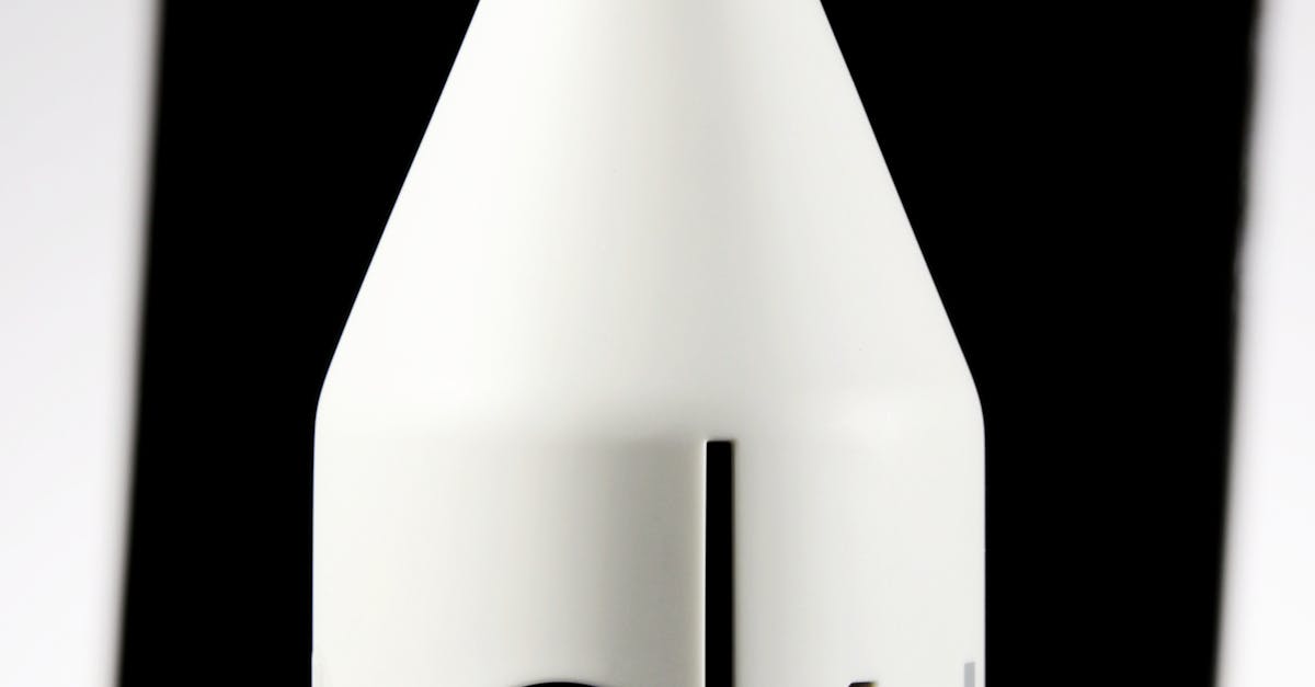
Table Of Contents
Experimenting with Symmetry and Asymmetry
Balancing elements within the frame can profoundly affect the overall impact of a photograph. Symmetry often conveys a sense of order and tranquility. When positioning products, centring them against a background can create a harmonious visual. Alternatively, asymmetrical compositions tend to evoke energy and movement. Offsetting the subject can lead to engaging and dynamic imagery that captures the viewer's attention.
Experimentation is crucial when navigating these approaches. Playing with various angles helps uncover unique perspectives. Adjusting the placement of products in relation to other objects or elements in the frame can reveal surprising compositions. By alternating between symmetrical and asymmetrical setups, photographers can evoke different moods and appeal to diverse audience preferences. Encouraging an iterative process fosters creativity and can enhance the storytelling aspect of product photography.
Finding the Right Balance for Dynamic Shots
Creating dynamic shots involves thoughtful positioning of products within the frame. Symmetry can offer a sense of calm and order, while asymmetry can introduce energy and intrigue. Striking the right balance between the two can enhance visual interest. Experimenting with the placement of your subject in relation to other elements helps establish a focal point. Rule of thirds is a useful guideline, though deviating from this can produce unexpected and compelling results.
Incorporating negative space plays a crucial role in directing attention to the product. Adequate space around your subject can highlight its features effectively. This approach encourages viewers to engage with the product rather than becoming distracted by clutter. Adjusting angles and perspectives can further influence the viewer's experience, making the composition feel fresh. Each element in your shot contributes to the overall narrative, ensuring that balance maintains both visual appeal and a clear emphasis on the product.
The Role of Colour Theory
Colour theory plays a vital role in product photography, influencing the viewer's emotions and perceptions of the product. Understanding the psychological effects of different colours can help photographers make informed decisions when composing images. For instance, warm colours such as red and orange can evoke feelings of excitement and energy, making them ideal for products meant to stimulate action. In contrast, cooler colours like blue and green often convey calmness and reliability, which can be advantageous for brands that want to instil trust.
Selecting the right colour palette not only enhances the aesthetics of the shot but also ensures that the product stands out. A harmonious combination of colours can create visual interest without overwhelming the viewer. For instance, a complementary colour scheme can draw attention to a product while still maintaining a cohesive look with the surroundings. Careful consideration of colour interactions can elevate a simple product image into something truly captivating.
Selecting the Right Palette for Products
Choosing the right colour palette for product photography involves understanding the emotional and psychological impacts of colours. Different hues evoke various feelings and associations. For instance, warm colours like red and orange can create a sense of urgency and excitement, whereas cool colours such as blue and green often promote a feeling of calm and trust. It’s essential to consider not only the product itself but also the target audience when determining which colours will resonate the most effectively.
In addition to emotional responses, the palette should complement the product’s design and packaging. Neutral backgrounds can enhance the presence of vibrant products, while monochromatic schemes may work well for minimalist pieces. Visual consistency throughout product lines also strengthens branding. Testing various combinations and observing their impact on the overall composition can lead to more engaging and visually appealing images.
Utilizing Textures Effectively
Incorporating a variety of textures in product photography can enhance visual interest and create a more immersive experience for viewers. Different materials can evoke distinct emotions and associations. Products placed against textured backdrops, like rustic wood or soft fabric, can add depth and context. The interplay between smooth and rough surfaces draws the eye and encourages engagement, making products more appealing in the context of lifestyle imagery.
To effectively utilise textures, careful consideration of lighting is essential. Soft, diffused light can enhance surface details, bringing out the nuances in materials such as metal, glass, or fabric. Highlighting textures through shadows and highlights provides a multi-dimensional quality to the images. Experimentation with different angles can reveal hidden details and create a compelling visual narrative that tells a story about the product, enhancing its desirability.
Adding Dimension with Textural Elements
Incorporating textures into product photography can transform a flat image into a visually engaging experience. Textural elements such as fabrics, wood, or stone can create depth and interest. These materials can complement or contrast with the product, enhancing its appeal. When integrating textures, consider the relationship between the product and its surroundings. A clean surface may help highlight the details of ornate items, while a rustic background can emphasise a product's organic quality.
Lighting plays a crucial role in showcasing these textures. Soft lighting can accentuate finer details, while harsher light might highlight contours and surfaces. Experimenting with different light sources can reveal unique textural qualities that add dimension to your shots. Incorporating a variety of textures not only elevates the aesthetic but also conveys a tactile sensation, inviting potential buyers to engage with the product on a more personal level.
FAQS
What is the difference between symmetry and asymmetry in product photography?
Symmetry involves creating balance by placing elements evenly on either side of a central line, while asymmetry focuses on a more dynamic and visually engaging composition, where elements are balanced through contrast and visual weight rather than perfect alignment.
How can I achieve a balanced composition in my product shots?
To achieve balance, consider the placement of your product in relation to other elements in the frame, like props and backgrounds. Use the rule of thirds, leading lines, and varying sizes and shapes to create a dynamic composition that draws the viewer’s eye.
Why is colour theory important in product photography?
Colour theory helps you understand how colours interact and affect the viewer’s perception. By utilising colour palettes effectively, you can enhance the appeal of your products, evoke emotions, and create a cohesive look that resonates with your target audience.
What factors should I consider when selecting a colour palette for my product photography?
When choosing a colour palette, consider the brand identity, the product’s characteristics, and the emotions you want to evoke. Aim for complementary or analogous colours that enhance the product’s features and create an inviting atmosphere.
How can textures enhance my product photography?
Textures add depth and interest to your images by creating a sense of dimension. Incorporating textural elements in the background or alongside the product can help highlight its features, making it more appealing and engaging for viewers.
Related Links
Utilizing Natural Light for Stunning Product ShotsInnovative Approaches to Flat Lay Product Photography
The Importance of Consistent Branding in Product Photography
Exploring Macro Photography for Detail Shots
Techniques for Capturing Product Textures